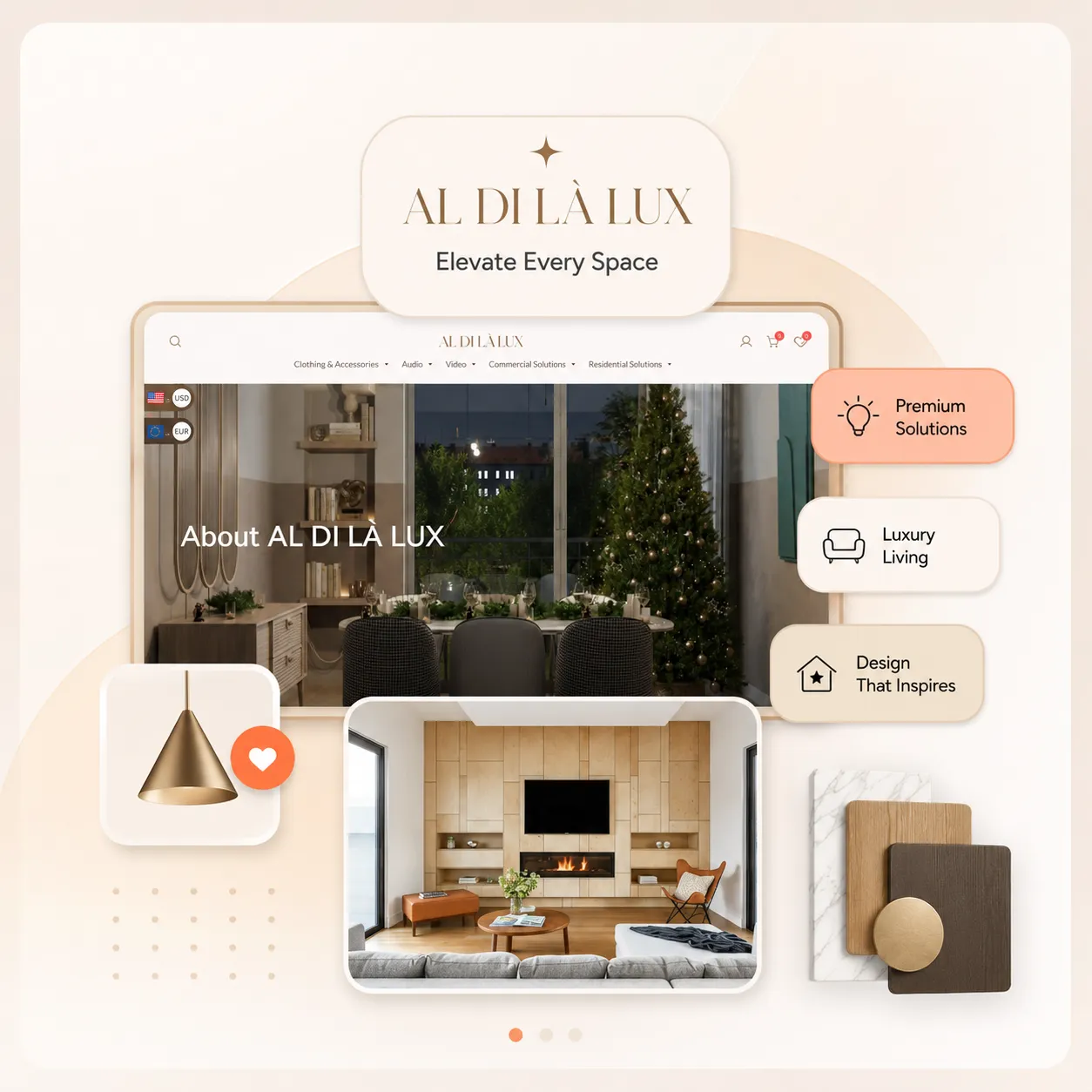
Luxury reads through restraint, and the previous site worked against that with busy layouts and competing calls to action. The rebuild strips the page back to generous spacing and photography at full width.
- 01
Set the tone
Chose a quiet type scale and a narrow palette so nothing competes with the imagery.
- 02
Let images breathe
Built full-bleed image sections with unhurried scroll transitions instead of dense grids.
- 03
Guide, do not push
Reduced each page to a single clear next step rather than several competing buttons.
A restrained brand site for a luxury label, built so the product photography carries the page.
@aldilalux